Publication-Ready Figures with neuro_py
Build cleaner, sharper neuroscience figures that drop directly into manuscripts with the right physical size and typography.
This tutorial shows how to combine:
- set_plotting_defaults(workflow) to match journal/document typography
- set_size(width, fraction, subplots, ratio) to get exact final figure dimensions
- show_scaled(fig, scale) for display-only notebook scaling that preserves saved figure size
By the end, you’ll have reusable plotting patterns for single-panel, multi-panel, and workflow-specific exports (nature, word, latex).
import matplotlib.pyplot as plt
import numpy as np

from neuro_py.plotting.figure_helpers import (
    set_plotting_defaults,
    set_size,
    show_scaled,
)

SAVE_FIG = False
Available Workflows
| Workflow | Font | Font Size | Target |
|---|---|---|---|
"nature" |
Helvetica / Arial | 7pt | Nature, Science, Cell, Neuron |
"word" |
Times New Roman | 11pt | Word / Google Doc manuscripts |
"latex" |
CMU Serif / Latin Modern | 10pt | LaTeX article submissions |
Available Width Presets
| Preset | Width (pt) | Width (mm) | Use case |
|---|---|---|---|
nature_single |
255 | 90mm | Nature single column |
nature_double |
510 | 180mm | Nature double column |
science_single |
162 | 57mm | Science single column |
science_double |
343 | 121mm | Science double column |
science_triple |
521 | 184mm | Science full width |
cell_single |
241 | 85mm | Cell/Neuron single column |
cell_1p5 |
323 | 114mm | Cell/Neuron 1.5 column |
cell_double |
493 | 174mm | Cell/Neuron double column |
single_col |
255 | 90mm | Generic single column |
double_col |
510 | 180mm | Generic double column |
textwidth |
418 | 147mm | LaTeX article textwidth |
thesis |
427 | 151mm | Thesis textwidth |
beamer |
307 | 108mm | Beamer presentation |
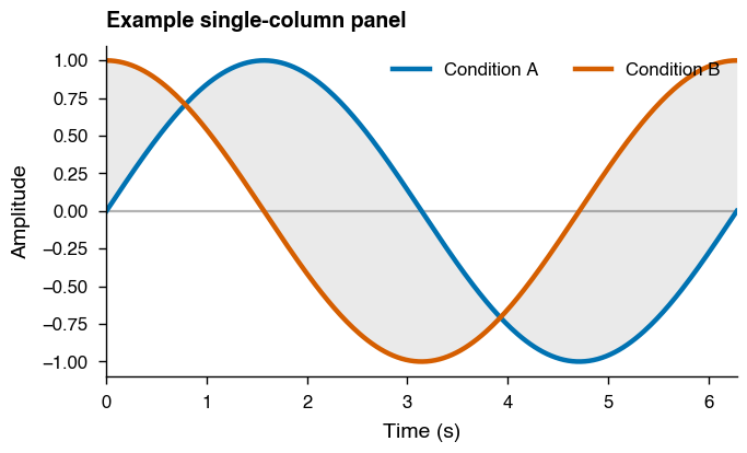
1. Basic Usage — Nature Workflow
set_plotting_defaults("nature")

# Single-column figure sized for Nature
fig, ax = plt.subplots(figsize=set_size("nature_single"), dpi=200)

x = np.linspace(0, 2 * np.pi, 300)
signal_a = np.sin(x)
signal_b = np.cos(x)

ax.plot(x, signal_a, label="Condition A", lw=1.6)
ax.plot(x, signal_b, label="Condition B", lw=1.6)
ax.fill_between(x, signal_a, signal_b, alpha=0.12, color="0.35", linewidth=0)

ax.set_xlabel("Time (s)")
ax.set_ylabel("Amplitude")
ax.set_title("Example single-column panel", loc="left", fontweight="bold")
ax.axhline(0, color="0.7", lw=0.8, zorder=0)
ax.margins(x=0)
ax.legend(frameon=False, ncol=2, loc="upper right")

fig.tight_layout()
if SAVE_FIG:
    fig.savefig("nature_single.svg", bbox_inches="tight")
plt.show()
2. Multi-Panel Figure — Double Column
set_plotting_defaults("nature")

# set_size adjusts height automatically for subplot grids
fig, axes = plt.subplots(
    1, 2, figsize=set_size("nature_double", subplots=(1, 2)), dpi=200
)

np.random.seed(42)
t = np.linspace(0, 1, 200)
spikes = np.random.poisson(5, size=(20, 200))

# Panel A — raster plot
for i, train in enumerate(spikes):
    spike_times = t[train > 0]
    axes[0].vlines(spike_times, i + 0.5, i + 1.5, linewidth=0.5, alpha=0.9)
axes[0].set_xlabel("Time (s)")
axes[0].set_ylabel("Neuron")
axes[0].set_title("A  Spike Raster", loc="left", fontweight="bold")

# Panel B — firing rate with smoothed trend
rate = spikes.mean(axis=0)
smooth = np.convolve(rate, np.ones(15) / 15, mode="same")
axes[1].plot(t, rate, alpha=0.35, lw=1.0, label="Raw")
axes[1].plot(t, smooth, lw=1.8, label="Smoothed")
axes[1].set_xlabel("Time (s)")
axes[1].set_ylabel("Firing Rate (Hz)")
axes[1].set_title("B  Population Rate", loc="left", fontweight="bold")
axes[1].legend(frameon=False, loc="upper right")

for a in axes:
    a.axvline(0.5, ls="--", color="0.75", lw=0.8)
    a.margins(x=0)

fig.tight_layout()
if SAVE_FIG:
    fig.savefig("nature_double_panel.svg", bbox_inches="tight")
plt.show()
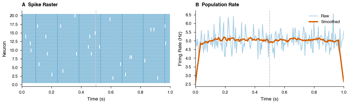
The subplots=(1, 2) argument to set_size adjusts the figure height so that each panel has a golden ratio aspect ratio rather than the whole figure.
3. Using fraction — Half-Width Figures
set_plotting_defaults("nature")

# Half of a double column — useful for inset-style figures
fig, ax = plt.subplots(figsize=set_size("nature_double", fraction=0.5), dpi=200)

np.random.seed(0)
data = [np.random.normal(loc, 0.5, 50) for loc in [1, 2, 3]]
bp = ax.boxplot(data, tick_labels=["Pre", "Task", "Post"], patch_artist=True)

for patch, face in zip(bp["boxes"], ["#88CCEE", "#CC6677", "#44AA99"]):
    patch.set_facecolor(face)
    patch.set_alpha(0.5)

ax.set_ylabel("Firing Rate (Hz)")
ax.set_title("Half-width summary panel", loc="left", fontweight="bold")
ax.grid(axis="y", alpha=0.2, lw=0.5)

fig.tight_layout()
if SAVE_FIG:
    fig.savefig("nature_half.svg", bbox_inches="tight")
plt.show()
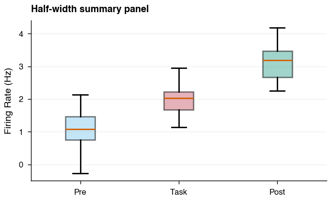
In practice, fraction is the main knob for fitting figures to your layout.
A good workflow is to start with fraction=1.0 and reduce until axis labels
occupy a comfortable proportion of the figure width:
# Start here and adjust until it looks right
fig, ax = plt.subplots(figsize=set_size("nature_double", fraction=0.6))
The font sizes stay fixed — only the figure dimensions change — so reducing
fraction makes labels appear relatively larger compared to the plot area.
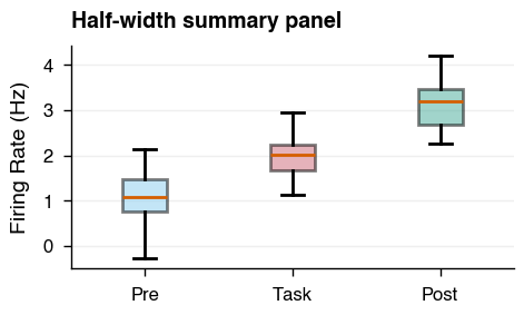
set_plotting_defaults("nature")

# Tip: adjust fraction until axis labels fill the figure naturally
fig, ax = plt.subplots(figsize=set_size("nature_double", fraction=0.35), dpi=200)

np.random.seed(0)
data = [np.random.normal(loc, 0.5, 50) for loc in [1, 2, 3]]
bp = ax.boxplot(data, tick_labels=["Pre", "Task", "Post"], patch_artist=True)

for patch, face in zip(bp["boxes"], ["#88CCEE", "#CC6677", "#44AA99"]):
    patch.set_facecolor(face)
    patch.set_alpha(0.5)

ax.set_ylabel("Firing Rate (Hz)")
ax.set_title("Half-width summary panel", loc="left", fontweight="bold")
ax.grid(axis="y", alpha=0.2, lw=0.5)

fig.tight_layout()
if SAVE_FIG:
    fig.savefig("nature_half.svg", bbox_inches="tight")
plt.show()
4. Overriding the Aspect Ratio
set_plotting_defaults("nature")

# Square figure — useful for place field maps, correlation matrices
fig, axes = plt.subplots(
    1, 2, figsize=set_size("nature_double", ratio=1.0, subplots=(1, 2)), dpi=200
)

np.random.seed(1)
place_field = np.random.rand(20, 20)
corr_matrix = np.corrcoef(np.random.rand(10, 50))

# Panel A — place field heatmap
im1 = axes[0].imshow(place_field, cmap="hot", aspect="equal")
axes[0].set_xlabel("Position X (cm)")
axes[0].set_ylabel("Position Y (cm)")
axes[0].set_title("A  Place Field", loc="left", fontweight="bold")
plt.colorbar(im1, ax=axes[0], label="Rate (Hz)")

# Panel B — correlation matrix
im2 = axes[1].imshow(corr_matrix, cmap="RdBu_r", vmin=-1, vmax=1, aspect="equal")
axes[1].set_title("B  Correlation Matrix", loc="left", fontweight="bold")
plt.colorbar(im2, ax=axes[1], label="Correlation")

fig.tight_layout()
if SAVE_FIG:
    fig.savefig("nature_square.svg")
plt.show()
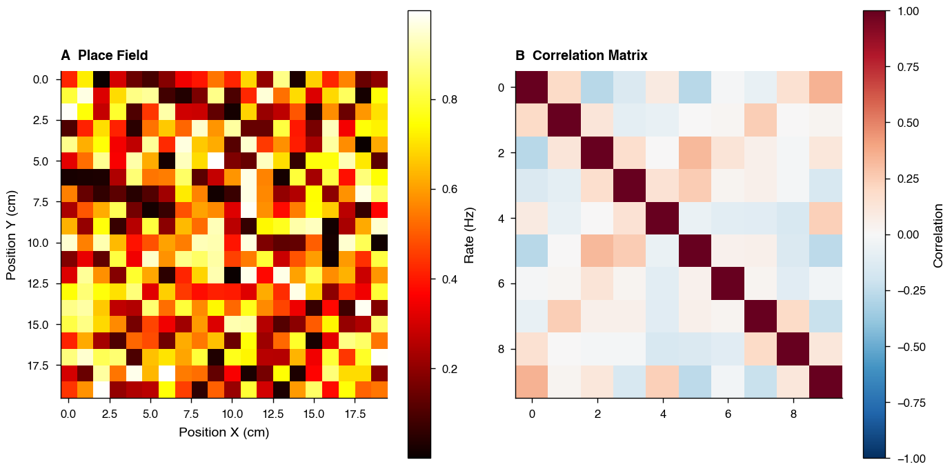
The default golden ratio (~0.618) is ideal for line plots, but ratio=1.0 gives square panels which is better for spatial maps and matrices.
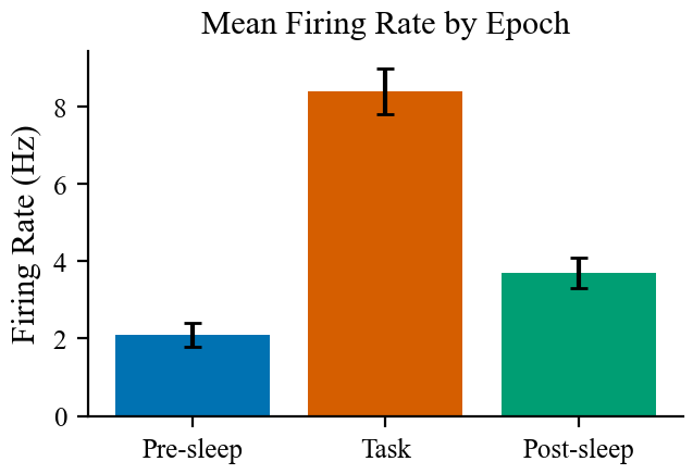
5. Word Workflow
set_plotting_defaults("word")

# single_col maps to nature_single width — good default for Word figures
fig, ax = plt.subplots(figsize=set_size("single_col"), dpi=200)

np.random.seed(3)
epochs = ["Pre-sleep", "Task", "Post-sleep"]
means = [2.1, 8.4, 3.7]
sems = [0.3, 0.6, 0.4]

ax.bar(epochs, means, yerr=sems, capsize=3, color=["#0072B2", "#D55E00", "#009E73"])
ax.set_ylabel("Firing Rate (Hz)")
ax.set_title("Mean Firing Rate by Epoch")

if SAVE_FIG:
    fig.savefig("word_bar.svg")
plt.show()
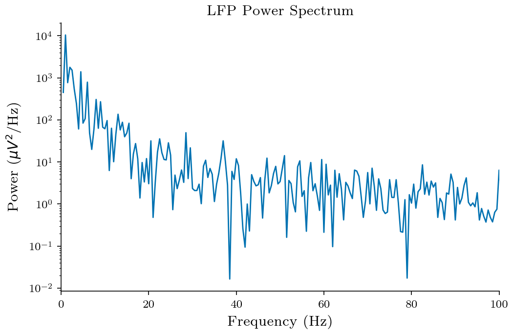
6. LaTeX Workflow
set_plotting_defaults("latex")

# textwidth matches \textwidth in a standard article class document
fig, ax = plt.subplots(figsize=set_size("textwidth"), dpi=200)

np.random.seed(5)
t = np.linspace(0, 2, 500)
theta = np.cumsum(np.random.randn(500)) * 0.1
power = np.abs(np.fft.rfft(theta)) ** 2
freqs = np.fft.rfftfreq(500, d=1 / 250)

ax.semilogy(freqs[1:], power[1:])
ax.set_xlabel("Frequency (Hz)")
ax.set_ylabel("Power ($\\mu V^2$/Hz)")
ax.set_title("LFP Power Spectrum")
ax.set_xlim(0, 100)

if SAVE_FIG:
    fig.savefig("latex_spectrum.svg")
plt.show()
For half-width figures in a LaTeX document (e.g. two figures side by side with \includegraphics[width=0.5\textwidth]):
fig, ax = plt.subplots(figsize=set_size("textwidth", fraction=0.5))
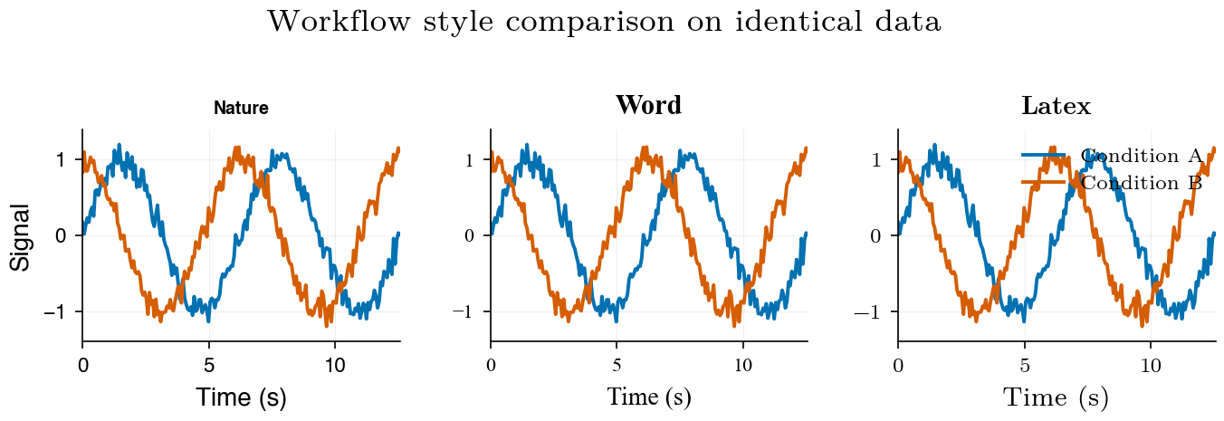
7. Comparing Workflows Side by Side
To make font differences visible in a single figure, this demo applies workflow-specific font families directly to each panel (instead of relying only on global style settings).
np.random.seed(7)
x = np.linspace(0, 4 * np.pi, 200)
y1 = np.sin(x) + np.random.normal(0, 0.1, 200)
y2 = np.cos(x) + np.random.normal(0, 0.1, 200)

workflows = ["nature", "word", "latex"]
demo_fonts = {
    "nature": "Helvetica",
    "word": "Times New Roman",
    "latex": "Latin Modern Roman",
}
ylim = (min(y1.min(), y2.min()) - 0.2, max(y1.max(), y2.max()) + 0.2)

fig, axes = plt.subplots(
    1, 3, figsize=set_size("nature_double", subplots=(1, 3), ratio=1), dpi=200
)

for ax, workflow in zip(axes, workflows):
    set_plotting_defaults(workflow)
    font = demo_fonts[workflow]

    ax.plot(x, y1, label="Condition A", lw=1.4)
    ax.plot(x, y2, label="Condition B", lw=1.4)
    ax.set_title(workflow.capitalize(), fontweight="bold", fontfamily=font)
    ax.set_xlabel("Time (s)", fontfamily=font)
    ax.set_ylim(*ylim)
    ax.margins(x=0)
    ax.grid(alpha=0.18, lw=0.5)

    for tick in ax.get_xticklabels() + ax.get_yticklabels():
        tick.set_fontfamily(font)

axes[0].set_ylabel("Signal", fontfamily=demo_fonts[workflows[0]])

legend = axes[-1].legend(frameon=False, loc="upper right", bbox_to_anchor=(1.02, 1.0))
for text in legend.get_texts():
    text.set_fontfamily(demo_fonts[workflows[-1]])

    fig.suptitle("Workflow style comparison on identical data", y=1.01)
fig.tight_layout()

if SAVE_FIG:
    fig.savefig("compare_workflows.svg", bbox_inches="tight")
plt.show()
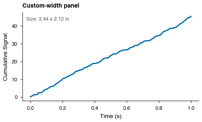
8. Passing a Custom Width
If your journal has a specific column width not in the presets, pass the width in points directly. To convert from mm: width_pt = width_mm * 2.8346.
set_plotting_defaults("nature")

# eLife single column: 87.6 mm -> points
elife_single_pt = 87.6 * 2.8346
fig_w, fig_h = set_size(elife_single_pt)

fig, ax = plt.subplots(figsize=(fig_w, fig_h), dpi=200)
trace = np.random.default_rng(11).random(100).cumsum()
ax.plot(np.linspace(0, 1, 100), trace, lw=1.5)
ax.set_xlabel("Time (s)")
ax.set_ylabel("Cumulative Signal")
ax.set_title("Custom-width panel", loc="left", fontweight="bold")
ax.text(
    0.02,
    0.95,
    f"Size: {fig_w:.2f} x {fig_h:.2f} in",
    transform=ax.transAxes,
    va="top",
    fontsize=6,
    color="0.35",
)

fig.tight_layout()
plt.show()
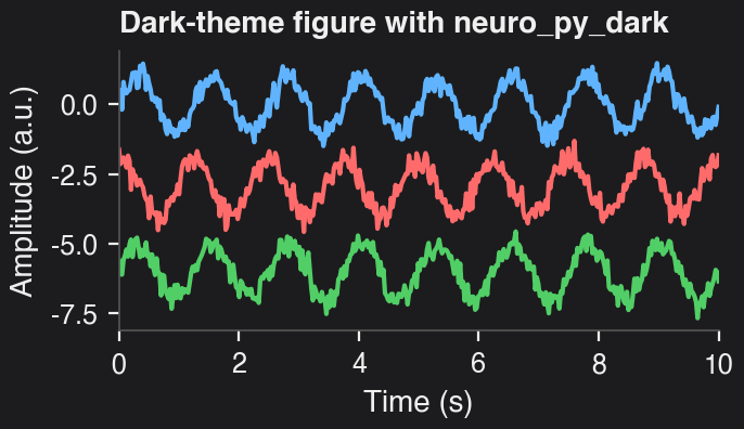
9. Dark Theme with neuro_py_dark
For talks, posters, or dark slide decks, you can apply the provided neuro_py_dark.mplstyle file in a local style context without changing the rest of the notebook defaults.
set_plotting_defaults("dark")

fig, ax = plt.subplots(figsize=set_size("nature_single"), dpi=200)
rng = np.random.default_rng(21)
x = np.linspace(0, 10, 400)
signal = np.sin(2 * np.pi * 0.8 * x) + 0.25 * rng.normal(size=x.size)
ax.plot(x, signal, label="LFP-like trace")
signal = np.cos(2 * np.pi * 0.8 * x) + 0.25 * rng.normal(size=x.size)
ax.plot(x, signal - 3, label="LFP-like trace")
signal = np.sin(2 * np.pi * 0.8 * x) + 0.25 * rng.normal(size=x.size)
ax.plot(x, signal - 6, label="LFP-like trace")
ax.set_xlabel("Time (s)")
ax.set_ylabel("Amplitude (a.u.)")
ax.set_title("Dark-theme figure with neuro_py_dark", loc="left", fontweight="bold")
ax.margins(x=0)

fig.tight_layout()
if SAVE_FIG:
    fig.savefig("dark_style_demo.svg", bbox_inches="tight")
plt.show()
10. Notebook Display Scaling
Modern notebook frontends may render Matplotlib figures at their logical figure size rather than their raw PNG pixel size. In those environments, increasing dpi improves sharpness but does not make the figure appear larger on screen.
Use show_scaled(...) in place of plt.show() when you want a larger notebook display while keeping the underlying fig at its original publication size for savefig(...).
Use scale_figsize(...) together with figure_scale(...) when you actually want to create a larger scaled figure object.
set_plotting_defaults("nature")

x = np.linspace(0, 6 * np.pi, 500)
y = np.sin(x) + 0.15 * np.cos(4 * x)

fig, ax = plt.subplots(
    figsize=set_size("paper", fraction=0.5, subplots=(1, 1)),
    dpi=200,
)
ax.plot(x, y, label="Scaled display view")
ax.set_xlabel("Time (s)")
ax.set_ylabel("Amplitude")
ax.set_title("Notebook-scaled figure", loc="left", fontweight="bold")
ax.legend(frameon=False)
fig.tight_layout()
show_scaled(fig, scale=1.25)

Quick Recipe Card
Use this as a copy/paste checklist when preparing final figures:
from neuro_py.plotting.figure_helpers import show_scaled

# 1) Pick your destination workflow
set_plotting_defaults("nature")   # or "word", "latex"

# 2) Match figure width to target layout
fig, ax = plt.subplots(figsize=set_size("nature_single"))

# 3) Multi-panel layout (height auto-adjusts)
fig, axes = plt.subplots(2, 3, figsize=set_size("nature_double", subplots=(2, 3)))

# 4) For maps/matrices, force square axes
fig, ax = plt.subplots(figsize=set_size("nature_single", ratio=1.0))

# 5) Half-width panel for insets
fig, ax = plt.subplots(figsize=set_size("nature_double", fraction=0.5))

# 6) Optional: scale for notebook display while preserving proportions
scale = 1.5
show_scaled(fig, scale=scale)

# 7) Save vector output for publication
fig.savefig("figure.svg", bbox_inches="tight")
Tip: if labels look too small/large in your manuscript, verify that the figure is inserted at its intended physical width (not scaled in the editor).